Enhancing a touch screen experience
I was part of a larger team tasked with preparing content for a workshop aimed at pitching an idea to a global energy company. The focus was on presenting leading energy trends within the sector, along with technological and service support options. The challenge was to create an interactive presentation for a touchscreen wall. The following results used PowerPoint as output.
Quick disclaimer: for confidentiality purposes, the documents I am sharing on this portfolio project have been sanitised, as texts, figures and logos have been replaced.

The Challenge
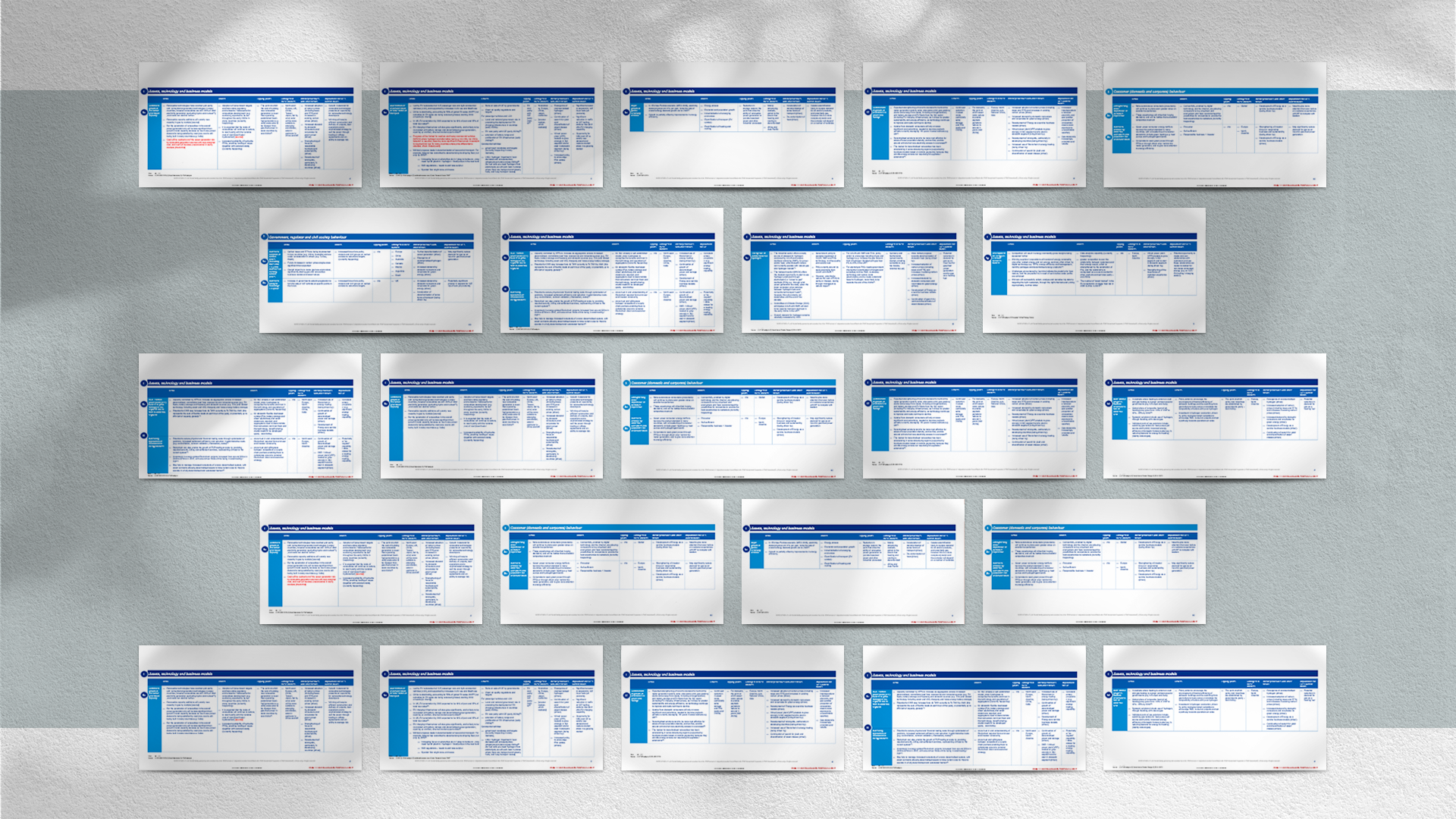
My primary challenge was to transform a complex spreadsheet into a visually engaging presentation. To achieve this, I began by identifying patterns within the content's key messages. Below is a quick example in how the raw document originally was.
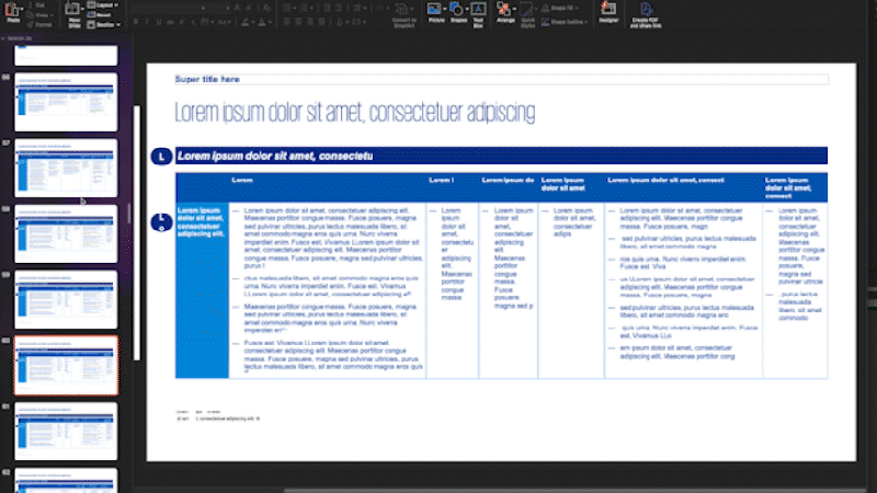
Building it up: designing from patterns and key messages
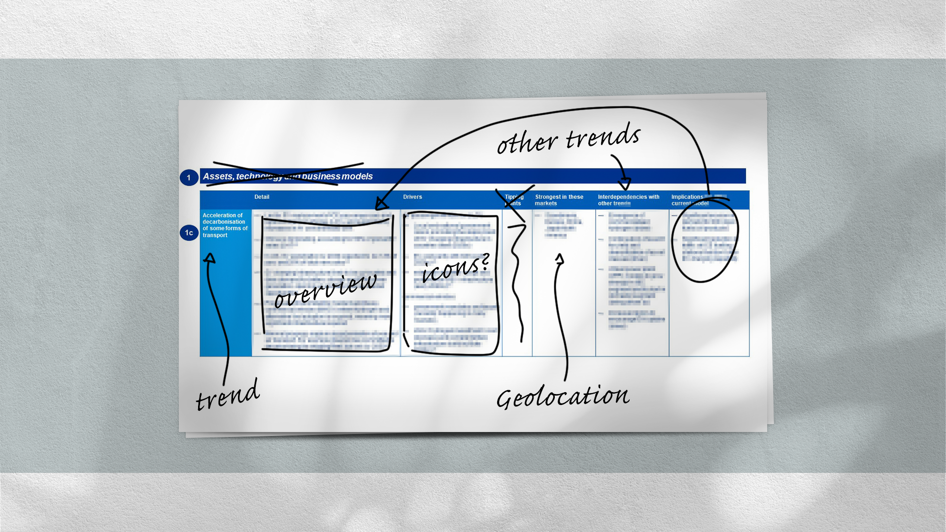
For example, I noticed that trend titles on the left side of the slides repeated on the right column of subsequent slides, illustrating their interconnectedness. Similar patterns emerged throughout the document, such as countries and themes that could be represented using icons or simpler visualisations.
To ensure an effective presentation, it was crucial to minimize text and simplify the spreadsheet across multiple slides. With the patterns now in hands, I managed to build a network map, where each trend could be an interconnected node.
Enhanced Results
I constructed the presentation primarily using PowerPoint but also incorporated Illustrator and After Effects to enhance the visuals. The experience was rooted in the sponsor brand but was designed to be animated and interactive, deviating from the traditional "slide-after-slide" PowerPoint format. To make it in such way, I played a key role in structuring and storyboarding the content to ensure a logical flow.

The end product was a dynamic presentation that allowed the presenter to touch on specific major themes and drill down into further trend information. The relationships between different trends were visually represented using line connectors, enabling the presenter to select new trends at any point during the workshop. Please feel free to check it out on the video below.
Additionally, I created a supplementary document for workshop attendees, a deck of cards inspired by "Top Trumps." These cards summarised the trends, strengths, and relevant attributes discussed during the workshop, providing a tangible takeaway for participants.