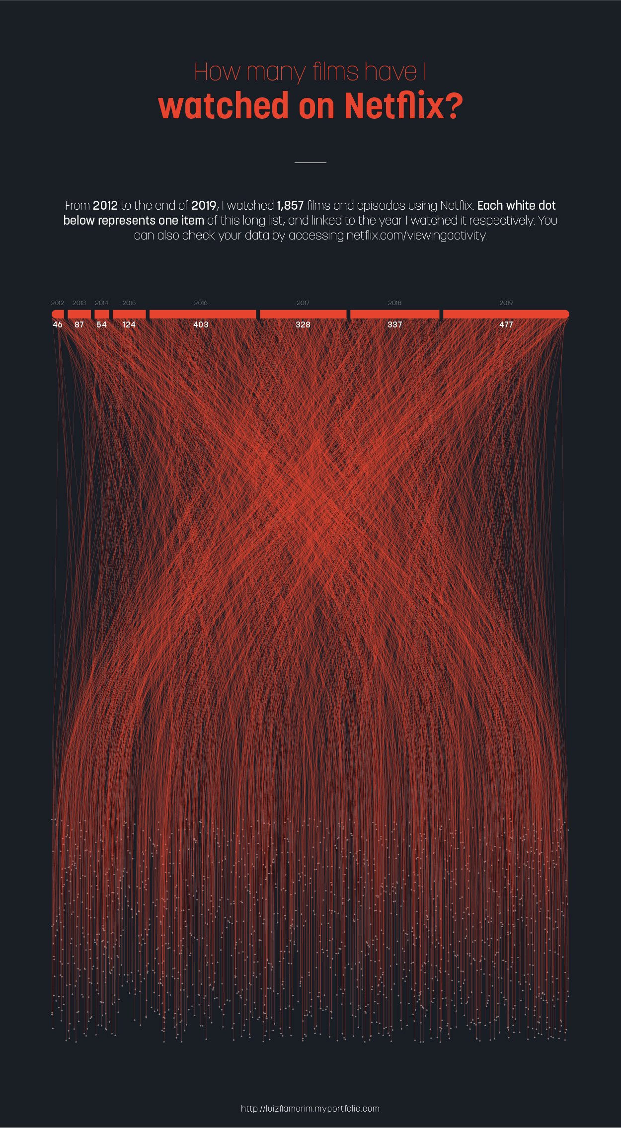
I have been studying coding since the end of 2019, as this comes hand in hand to data visualization, which is my passion. There are many free data sets to be explored, but in this case, I used my data available on the Netflix website.
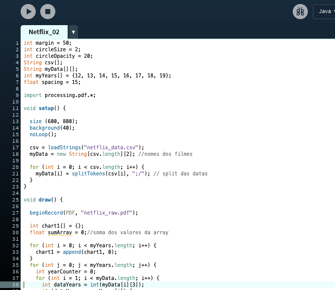
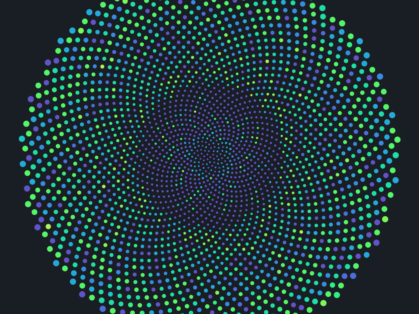
That was an exercise, as I developed a way to place 1,857 dots in a random position and connect them to a bar chart. All of it was generated by coding, as you can check on the screenshots below. I build it using my data set in CSV format, used Processing (Java) to make the skeleton of the infographic, and illustrator to treat the colours, and overall design.