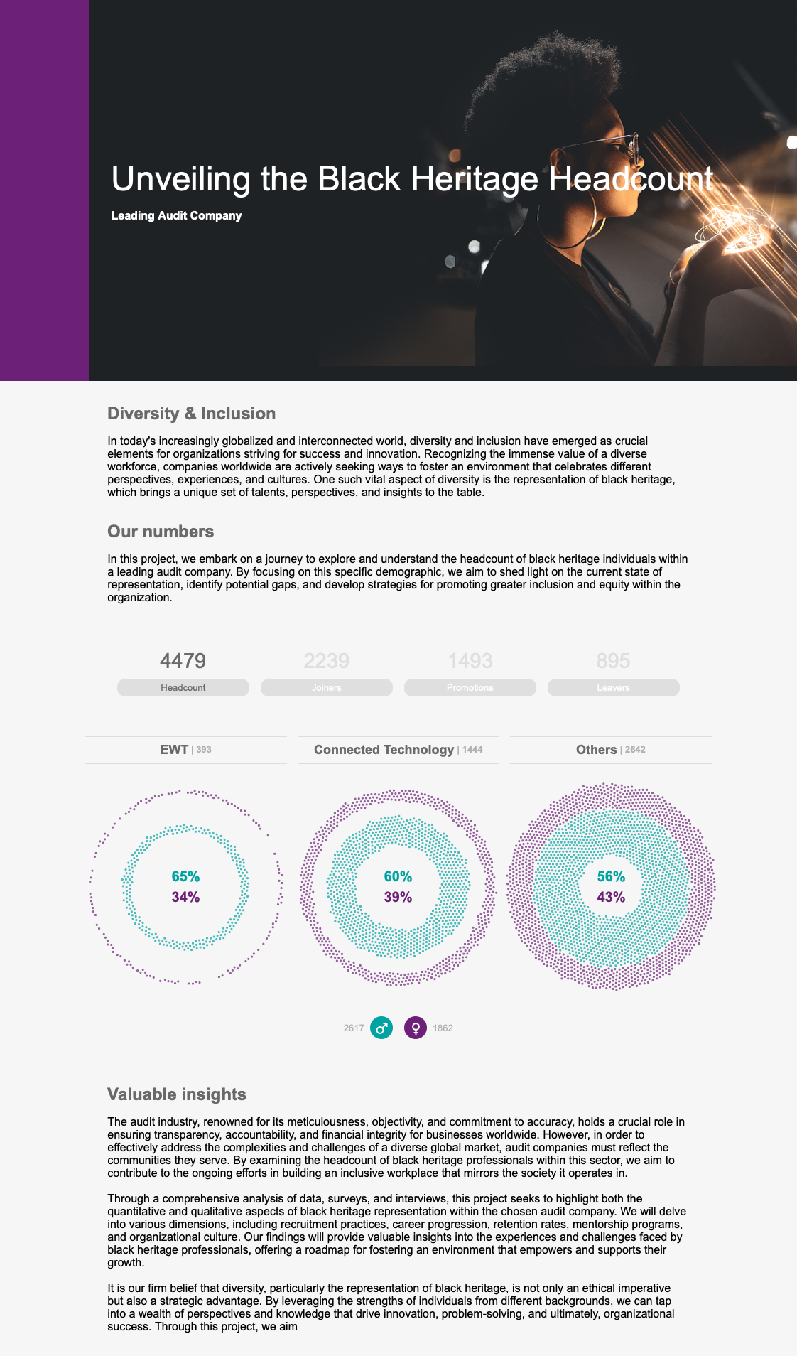
Unveiling the Black Heritage Headcount in a Leading Audit Company
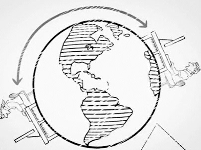
In today's interconnected world, diversity and inclusion are paramount to organizational success. This project focuses on examining the headcount of black heritage individuals within a leading audit company, aiming to uncover the current state of representation, identify gaps, and develop strategies for fostering greater inclusion. By analysing the enterprise-wide technology teams only, I aimed to provide valuable insights through a visualisation that will empower the company to build an environment that celebrates and supports the growth of black heritage professionals.
The Dataset & Normalisation
One of the primary hurdles encountered in this project was the analysis of a sizable dataset comprising approximately 12,000 records. During the briefing sessions, it became apparent that all the records were unique and had been accumulated over several years by the company. However, a notable challenge arose from the extensive history of internal handovers, resulting in a significant number of duplicated records due to legitimate reasons such as promotions.
To ensure accurate analysis, it was crucial to normalize the data and consolidate these duplicate records into unique entries. I wrote a Node app to make this task, which grouped the same IDs and normalised the data such as office locations, job titles, service group, etc.

Building the visualisation
Using a reliable dataset, I began by creating straightforward charts to explore the data and uncover intriguing findings. One particularly useful discovery was the breakdown of categories across different departments. To present this information clearly, I decided to split the final visualisation into three charts, each reflecting the headcount for male and female employees, as well as new joiners, promotions, and leavers. To make the visualisation easily understandable, I opted for a radial force chart. This chart allows users to quickly grasp the representation of individuals, with different forces representing different genders. This choice of visualization aims to simplify the understanding of the workforce composition within the audit company.

Each dot on the chart can be touched and dragged, incentivising interactivity. By doing it so, the app brings a pop-up with further information about the individual.
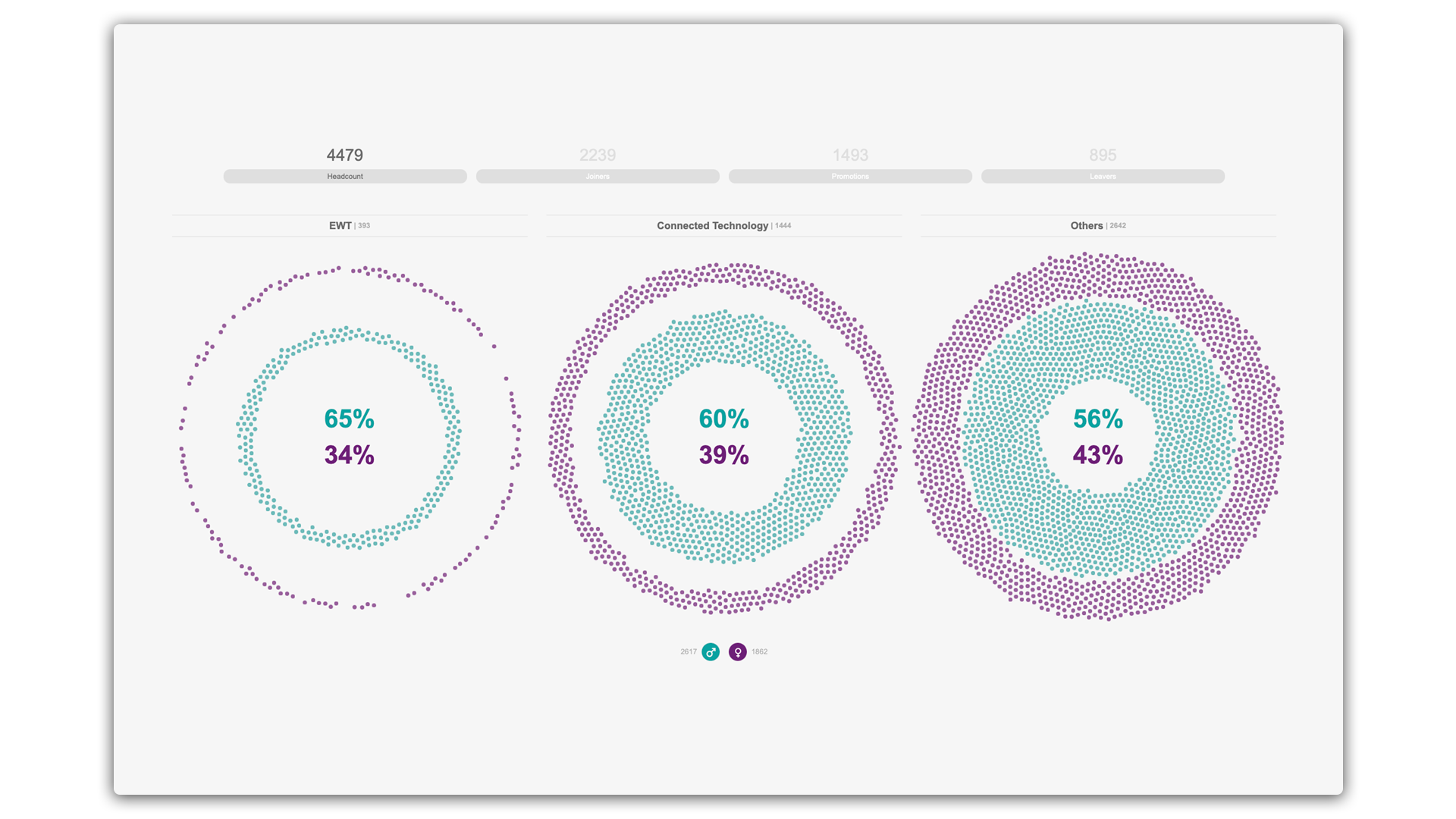
The charts section includes a set of filters positioned at the top, which not only allow users to refine their view but also unveil the corresponding figures. By simply pressing these filters, users can gain a clearer understanding of the gaps and explore different perspectives across twelve distinct data points.
Adjusting and deploying
As a Visualisation Designer, my main focus was to document the process thoroughly, ensuring that the application could be used in the future. After documenting everything, my final step was to test how the application worked on different devices and complete it as part of a webpage. To showcase the results, I included the charts in a simple website, as you can check on the video above, making it easy for the project sponsors to access and view them again whenever needed.